CSS3 Tag
| TAG | DESCRIPTION |
|---|---|
| element | Selects all instances of the specified HTML element. |
| .class | Selects all elements with the specified class attribute. |
| id | Selects a single element with the specified id attribute. |
| :hover | Selects elements when the mouse cursor is placed over them. |
| :active | Selects the active link (the link that is currently being clicked). |
| :visited | Selects visited links. |
| :focus | Selects the element that currently has focus (e.g., an input field). |
| :empty | Selects elements that have no children (including text nodes). |
| :checked | Selects input elements that are checked (e.g., checkboxes or radio buttons). |
| :disabled | Selects disabled form elements. |
| :enabled | Selects enabled form elements. |
CSS5 Property
| PROPERTY | DESCRIPTION |
|---|---|
| background-color: red | Specifies the background color of an element. |
| background-image: url(image.jpg) | Specifies the background image of an element. |
| background-repeat: repeat | Specifies how the background image is repeated. |
| background-position: top left | Specifies the position of the background image. |
| background-size: cover | Specifies the size of the background image. |
| background-attachment: fixed | Specifies whether the background image scrolls with the element or stays fixed. |
| background-clip: border-box | Specifies whether the background image is clipped to the borders of the element or extends beyond them. |
| background-origin: content box | Specifies the origin of the background image. |
| margin : auto | (Set random) |
| margin : 10px | (all side 10px) |
| margin: 10px 20px | (left right) |
| margin: 10px 20px 30px 30px | (top right bottom left) Sets the margins of an element on all sides. Margin also supports px, length, percentage, inherit |
| margin-top | Sets the top margin of an element. |
| margin-bottom | Sets the bottom margin of an element. |
| margin-left | Sets the left margin of an element. |
| margin-right | Sets the right margin of an element. |
| padding : auto | (Set random) |
| padding : 10px | (all side 10px) |
| padding: 10px 20px | (left right) |
| padding: 10px 20px 30px 30px | (top right bottom left) Sets the paddings of an element on all sides. Padding also supports px, length, percentage, inherit |
| padding-top | Sets the top padding of an element. |
| padding-bottom | Sets the bottom padding of an element. |
| padding-left | Sets the left padding of an element. |
| padding-right | Sets the right padding of an element. |
| border-radius: 5px; or border-radius: 5px 10px 15px 20px; | Sets the radius of the corners of the border. Can be specified as a single value for all four corners, or as four separate values, one for each corner. |
| border-top: 1px solid black; | Sets the properties of the top border. |
| border-right: 1px solid black; | Sets the properties of the right border. |
| border-bottom: 1px solid black; | Sets the properties of the bottom border. |
| border-left: 1px solid black; | Sets the properties of the left border. |
| height: 200px; | Sets the height of an element. |
| width: 300px; | Sets the width of an element. |
| outline: 2px solid blue; | Creates a visible outline around an element, similar to border, but without affecting layout. |
| color: #333; font-size: 16px; text-decoration: underline; | Properties for controlling text appearance, spacing, and decoration. |
| font: 16px arial, sans-serif; | Sets various font properties like size, weight, style, and family. |
| display: inline-block; | Defines how an element should be displayed (e.g., block, inline, flex). |
| max-width: 800px; | Sets the maximum width an element can have. |
| image { float: left; margin-right: 20px; } | Positions an element on the left or right of its container, allowing text and other elements to wrap around it. |
| .box { display: inline-block; width: 100px; height: 100px; background-color:f0f0f0; } | Combines features of inline and block elements, allowing them to flow inline while retaining block-level properties. |
| opacity: 0.5; | Sets the opacity (transparency) of an element. |
| @media screen and (min-width: 480px) { | |
| } | |
| display: flex; | Turns an element into a flex container. |
| flex-direction: row; | Defines the direction of the flex container’s main axis. |
| flex-wrap: wrap; | Controls whether flex items should wrap if they exceed the container’s width. |
| flex-flow: row wrap; | Shorthand for flex-direction and flex-wrap. |
| justify-content: space-between; | Aligns flex items along the main axis. |
| align-items: center; | Aligns flex items along the cross axis. |
| align-content: space-around; | Aligns lines of flex items along the cross axis when there is extra space in the container. |
| order: 2; | Specifies the order in which flex items appear. |
| align-self: flex-end; | Overrides the align-items value for a single flex item. |
| display: grid; | Turns an element into a grid container. |
| grid-template-columns: 1fr 2fr 1fr; | Defines the size and number of columns in the grid. |
| grid-template-rows: auto 100px; | Defines the size and number of rows in the grid. |
| grid-template-areas: “header header header” “main sidebar sidebar” “footer footer footer”; | Assigns names to grid areas and lays out the grid based on those names. |
| justify-items: center; | Aligns grid items along the inline (row) axis. |
| align-items: end; | Aligns grid items along the block (column) axis. |
| place-items: center start; | Shorthand for align-items and justify-items. |
| justify-content: space-between; | Aligns grid content along the inline (row) axis when there’s extra space. |
| align-content: space-around; | Aligns grid content along the block (column) axis when there’s extra space. |
| place-content: center space-around; | Shorthand for align-content and justify-content. |
| grid-auto-columns: 100px; | Sets the size of implicitly created columns in the grid. |
| grid-auto-rows: minmax(100px, auto); | Sets the size of implicitly created rows in the grid. |
| grid-auto-flow: row dense; | Controls the placement of implicitly created items in the grid. |
| grid: auto-flow dense / repeat(3, 1fr); | Shorthand for various grid-related properties. |
| grid-column: 2 / span 2; | Specifies a grid item’s size and placement within the grid’s columns. |
| grid-row: 1 / 3; | Specifies a grid item’s size and placement within the grid’s rows. |
| grid-area: main; | Specifies a grid item’s size and placement using the grid’s named areas. |
Additional Properties
-
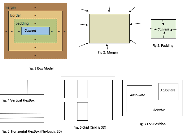
Z-index: This is actually the same as the stack concept. Suppose in a box (positioned absolute/relative) there are 2 or 3 color boxes, then which color will be on top and which will be at the bottom can be solved via this
z-index.z-index:1means top,0means bottom. More explanation: [link]. -
Order: If there are arrays like a, b, c, d, e, and I set
order:1for a, then the order will be b, c, d, e, a. Here b, c, d, e is0(not sorted), and a is1(sorted), which is why the sorted list will be shown last. If I set every element as order, my result will be shown as a, b, c, d, e (if there are any elements that are unordered ororder=1, they will stay on top, followed by ordered elements). -
Flexbox: Flexbox Game, Simulation and Code Generator
-
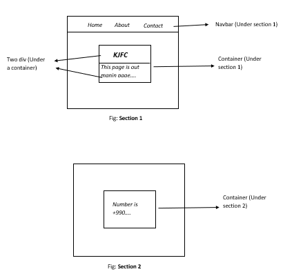
Section and Container: A portfolio page has 3-4 sections. If we scroll, we move to the about section, contact section, etc.